

The middle class is declining, or is it?
The question has taken on increased resonance in Canada since two respected and informed journalists—Chrystia Freeland and Linda McQuaig—have decided to enter politics.
Ms. Freeland is the author of Plutocrats: The Rise of the New Global Super Rich and the Fall of Everyone Else, and Ms. McQuaig a co-author of The Trouble with Billionaires.
Income inequality is what they know, and presumably what they feel should be a matter of public policy.
If the middle class is not shrinking then the policy program these individuals have to offer, and by reflection some of the policies of the political parties they hope to represent—the traditionally centrist Liberal Party in Ms. Freeland’s case, and the social democratic New Democratic Party in the case of Ms. McQuaig—are brought into question.

And that is what a number of observers have already done, arguing that the facts show the Canadian middle class is not under threat, and that those who argue otherwise—like Ms. Freeland and Ms. McQuaig—are spending too much time looking at American trends.
So this is an economic fact with some political impact.
My look at the numbers focuses on both incomes (the total amount of money a family brings home) and on wage rates (the hourly rate of an individual’s pay).
The trend in incomes is disturbing, but all the more so when viewed in light of a polarizing pattern in wage rates. These trends should be a real concern for public policy, and in my view a focus on other countries, particularly the United States, is one important way to constructively inform that concern.
1. Focus on the trend
What do you see when you look at this picture?
 I see a disturbing trend.
I see this because I want to focus on the underlying structure of the economy, and the most straightforward way to do this is to compare successive business cycle peaks: 1979 to 1989 to 2008.
In these years the economy was operating at its full potential, and incomes reflect the underlying productive capacity of businesses and the labour supply of individuals.
The typical household is now no better off, indeed about $3,000 worse off, than it was in the mid to late 1970s, in spite of 35 years of economic growth.
But others don’t see it this way. One observer has gone so far to say that:
while it may be true that over the whole 35-year period covered, the middle class’s income performance stagnated, that was owing to an exceptional period in the 1980s and 90s. Since 1998, income growth for the middle and lower classes nearly matched the increase for top earners.
… the picture painted by looking at the entire 35-year period is heavily skewed by the fact that there were two unrepresentative decades in the middle.
This is a very different focus on what is the appropriate underlying trend, one that views 20 of the last 35 years as a temporary aberration, and the remaining 15 years, associated with a run-up of resource prices, as permanent.
I don’t see commodity prices increasing indefinitely, and don’t see the last 15 years revealing the changes in the underlying structure of the economy and the jobs market.
The fact that a sustained resource boom has not increased median incomes higher than they were at the past economic booms suggests an underlying structural change that is working against the typical household.
2. Focus on the prices
What do you see when you look at this picture?
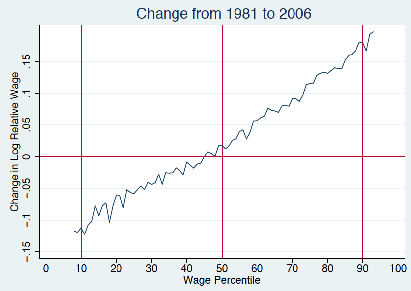
I see deeper trouble.
For economists, prices determine behaviour, and the important price to look at when the concern is with productivity and take-home pay is not oil or commodity prices, but the wage rate.
This picture shows very polarizing changes in wage rates (more specifically the weekly wage, which is as close as these data permit us to look at hourly wage rates).
Over the last couple of decades or more the median wage rate has hardly changed, and wage rates below the halfway point have fallen by five to as much as ten percentage points.
Over the same period they have risen even more significantly in the upper half of the wage distribution, by 10 to as much as 15 percentage points at the very top.
The hourly wage rate determines if an individual will decide to work or not, the number of hours to work in a week, and the number of weeks to work in a year.
This means that many families who face lower wage rates have to run harder just to stand still: incomes can be sustained only if both partners in a household are working. If they already both work then incomes will rise only if they work longer hours.
This means more stress, it means putting off having children, it means less security in housing and in relationships.
I now see that the previous picture describing income trends is not revealing the full extent of the insecurity with which some people have to live, and also the increasing prosperity of others.
3. Focus on the US
I see these trends with Canadian data. But I also see both future risks and possibilities more clearly by looking at the United States and other countries.
If changes in the structure of wage rates are the both the ultimate reflection of underlying productivity growth and the ultimate determinant of labour supply, then I need to understand what has changed wage rates and how public policy can influence outcomes.
The interaction of globalization and technical change are somehow influencing productivity growth and ultimately patterns in wage rates. And while these forces influence all of the rich countries, they have played out differently in each country because of institutional and policy differences.
An awareness of the experience and policy discussion in the United States sheds light on the impact of policies like falling real minimum wages, increasing low-skilled immigration, less investment in high quality accessible education in the early years, higher tuition fees, and limited parental leave.
And as a result I see more clearly the need and the possibilities for fundamentally changing tax and social policies, and promoting human capital investment in a way that favours families who have made little or no progress over the course of 30 years, others who have witnessed outright declines in their standard of living, and even others who in spite of their overall income levels face increased insecurity.
When I look elsewhere I see more clearly what needs to be defended, and what needs to be changed.
What do you see?

Your conclusion is spot on. Spending on military equipment rather than on early childhood education makes no sense. Low corporate taxes do not do the job needed to be done in human investment.
Low wage sector in Canada is too big. Precariat has replaced middle class as politically significant. Alienation from politics serves neoliberal interests.
Arrival of McQuaig, Freeeland hopeful sign of citizen engagement.
It seems to me that the major issue running across all of these pieces on changing inequality/insecurity over time is the one you pose in section 1: from what point in time do you start the underlying trend? I have a hard time seeing much bad stuff since about 1992. All the scare pieces form the last few years draw the line at 1981 – which was the start of an absolutely terrible decade. And while they’re technically correct to say things like “inequality worse noe than in 1981” it’s not very policy-relevant if all the movement happened 25 years ago. So I have to say when I look at your figure 2, I think “gee, powerful graph” – I’d have to see it drawn again with 1993 as a start-date to be convinced that there are current policies which are exacerbating inequality or middle-class insecurity.
Not to mention that the household income in the graph looks a lot better than would be expected because of there being more two income families. Single parent families are probably pulling it down.
Underlying the choice of variables to look is the desire to capture the quality of life of a middle income Canadian family, yes? Then we might also look for variables that capture the fact that the goods that we consume are much higher quality than in the 1975. Maybe I’m not spending so much money on vinyl records anymore, but I’m exposed to a huge amount of cheaper music (admittedly music is declining in quality from the 1970s, but I digress). The same goes for the gains from the internet, bigger and better televisions, etc. Medical care. The availability of cheap books. And the singular fact about all this stuff is that it impacts both the middle and the upper classes together–arguably lessening one aspect of inequality dramatically in a way that isn’t captured in measures of income.
This is an updated version of the argument that before capitalism the aristocrats wore silk, the people rags, but now every, one is wearing basically the same set of clothes. The effect is especially huge from the digital revolution, though.
The digital revolution doesn’t cut much ice with me. I can only consume so much entertainment. In the 70s people watched more TV, now they watch more Youtube videos. There are lots more channels and still nothing on, but the nothing fills a bigger screen now. None of that pays my mortgage. It’s nice and all, but it has little to do with whether the middle class is declining.
It’s unclear that the quality of more substantive things has improved. Talk to me about the durability of (sweatshop-produced) clothes, for instance. And medical care? Well, there have been some improvements in technology, to be sure. But there have also been increases in the overprescription of drugs with questionable benefits and serious side effects, and increases in problems with wait times, bed availability and so forth. At the same time user fees and prices for pharmaceuticals have increased. In many ways with medical care we seem to be paying more for less.
In fact, the reductions in pay don’t really capture another reality which is that many expenses have increased or new ones come into existence–user fees for services which used to be free, massive tuition levels and so on. The increase in two-income households masks reductions in per-person incomes, but also creates major expenses for daycare. So if you take a one-income household with children back then and a two-income household with children today and they appear to make the same income (inflation adjusted), in fact the two-income household is way more broke because they’re paying half an income just for daycare. People’s lives are more precarious now in many ways that these graphs don’t account for, and these effects are in my opinion far more powerful than any results you get from technological advances.
Looking back as a senior citizen ,I remember the ups & downs of the economy well . Targeting the Quality of life should not be forgotten ex housing ,number of holidays , health care , poverty ,jobs .
Aiming @ the middle class is not specific enough to hold politicians in check .
Can you answer Greg Mankiw’s chart here?
http://gregmankiw.blogspot.com/2013/07/the-changing-distribution-of-family.html
I just finished reading Bryan Caplan’s ‘The Myth of the Rational Voter’ (2007). He’s a libertarian economist who plays fast and loose with the data to support his conclusion that ‘lay people’ (generally, anyone who is not a free market economist) suffer from ‘pessimism bias’ which makes them believe the economy is getting worse. One piece of data he focuses on is mean household income rather than median household income; and he also trots out the ‘argument’ that the proliferation of low-paying ‘McJobs’ is somehow a temporary aberration to capitalist prosperity. So thanks for the numbers; this adds to my argument against Dr. Caplan.