
Inequality is increasing in Canada. Or is it?
A short report on the topic released by a major Canadian bank includes the bold heading “Income inequality has been unchanged in Canada — say what?”. This apparently contrarian finding has been seized upon by at least one influential pundit in a way that only serves to obstruct constructive public policy discussion.
A debate is in order, not over whether inequality has increased—because it has—but why this is important, and what could, or for that matter should, be done about it.
But this sort of discussion requires the best of our public commentators, and in this post I offer three rules for good pundit behaviour. Economic statistics can be confusing and they can be used in confusing ways, purposely or not, and so these rules might also be a set of general guideposts for the average reader to help separate fact from fiction, since after all we can’t expect pundits to always follow them.
Rule 1: Look for the underlying trends
Our first hint that something very important is happening comes from changes in the income of the typical household. Consider one commonly used measure of what might be considered “typical”: the median household income.
The median divides the income status of all households in the country down the middle: half make less than the median, and half more. The median is the income of households that are exactly in the middle, and in this sense we think of them as “typical”.
Median household income rises and falls. It was $50,900 in 1980, fell to less than $45,000 in 1983 and 1984, rose to over $48,000 by 1989 but then fell again, reaching a low of $39,1000 in 1996 before rising steadily since and reaching its latest peak at $47,900 in 2008.

The ups and downs represent the ebbs and flows of the business cycle: 1980, 1989 and 2008 being the high points of employment and economic growth just before the onset of recessions with growth slowing, employment falling, and not surprisingly families earning less.
To get a sense of underlying trends we need to look beyond these ups and downs. One way of doing this is to focus our eye on just the high points, when the economy is operating as close as possible to its full potential. Comparing peak years to other peak years allows us to abstract from cyclical fluctuations.
In this sense it is reasonable to suggest that the typical household is worse off now than it was thirty years ago: median incomes being $3,000 lower in 2008 than in 1980.
On the face of it this is not a good news story, particularly when you consider the fact that households are now more likely to have both partners working. Each successive business cycle peak is associated with lower incomes, a trend that may reasonably lead to us to view the future with pessimism.
But you can easily construct a good news story by comparing a business cycle trough to a peak, say just the period from the mid 1990s to 2008. This narrower perspective suggests typical households are making significantly more, and indeed the future looks good if things keep going this way.
This seems to be exactly what Andrew Coyne, a columnist for a major Canadian newspaper, is doing. Check out the exchange he has with Armine Yalnizyan at about 18:29 of this program on TVO, the provincial public broadcaster in Ontario. After indignantly stating that he is “not going to let people play with the numbers” he calls the idea of using information back to 1976 a statistical artifact countering with: “Since 1993 … median family incomes are up 20% … To try to construct this as some kind of bad news story just distorts the facts.”
But he is doing just that—distorting the facts—by suggesting that the data are driven by business cycles, not underlying trends.
So the converse of our rule 1 for good pundit behaviour is: If you want to obstruct the debate and score points for your side just choose the time horizon that is to your advantage.
Your best defence against this sort of obstruction: know the business cycle turning points. Here is a handy and authoritative guide for Canadian readers that you can download from the CD Howe Institute website.
Rule 2: Recognize that statistical concepts aren’t truths, they are tools to be used in situations for which they are appropriate. Use them carefully, improper use can be dangerous!
Mr. Coyne is repeatedly stating that he disagrees with the claim that inequality has increased in Canada.
But the proportion of households making a middle level income is falling.

And the proportions making both very low-income and very high incomes are rising.
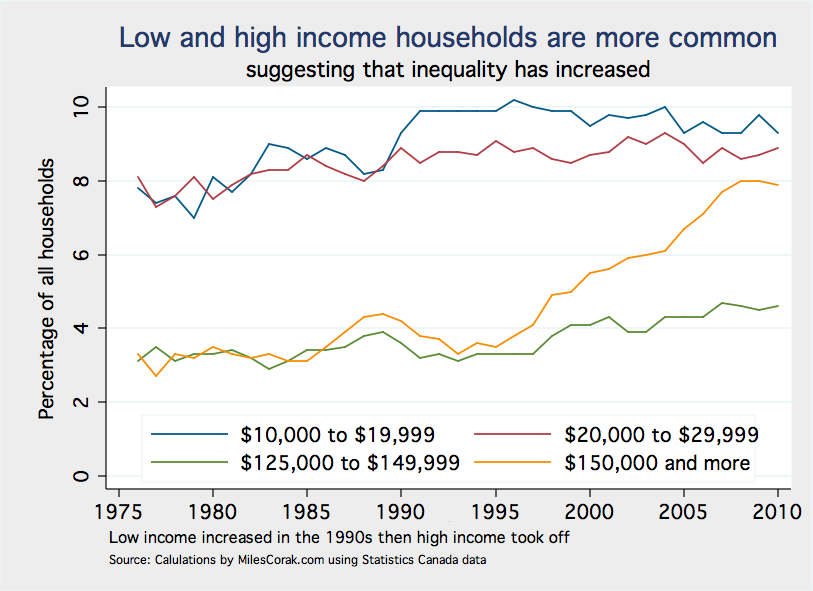
All these trends suggest that inequality should be on the rise.
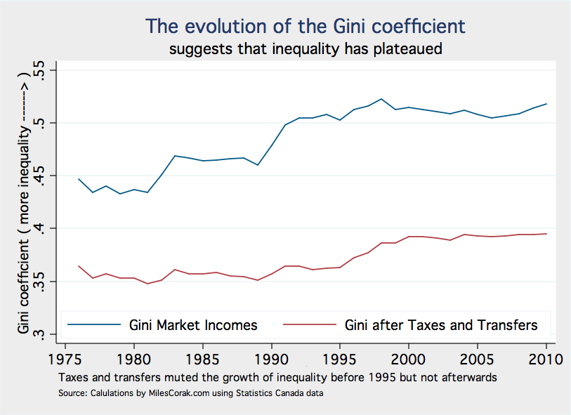
Yet the evolution of the Gini coefficient, the workhorse statistic used to gauge inequality, would seem to back Mr. Coyne up. It hasn’t changed much since about 1996, suggesting that the level of inequality has plateaued after having risen significantly since the 1970s.
What gives?
This is the question that puzzled the authors of a report released by the TD bank, which Mr. Coyne uses as exhibit 1 in his case against higher inequality in a column published on December 15th.
Well, the Gini coefficient by its very construction is not sensitive to changes in the extremes of the income distribution. It is a lens that just isn’t capable of bringing the true picture into focus if there are changes at very low and very high incomes.
This is why careful analysts are increasingly supplementing it with other measures that hone in at the bottom, and at the top.
Says Mr. Coyne:
Why is it common knowledge things are getting more unequal, when in fact they are not?
One reason is that we have shifted the definition of inequality…. attention has shifted to the gap between the very rich and everyone else.
Mr. Coyne is looking through the wrong part of his bifocals, clinging to the image sent by the Gini coefficient even though it wasn’t designed to do the job of picking up increases in inequality when they are the result of changes at the extremes.
It is not that the definition of inequality has been shifted by ideologues, it is that the nature of the beast is changing. Exploring the measurement of inequality with different tools and at different angles is not ideologically driven, as Mr. Coyne suggests, it is a pragmatic attempt at trying to capture a changing reality.
Consider an alternative picture of inequality in Canada that usefully supplements the Gini: the ratio of average incomes to median incomes. This ratio can go up if the median is falling, and as we have seen to some degree that is happening.
But it can also go up if the average is rising faster than the median, which it will do if incomes at the top are increasing, the average being sensitive to outliers.
Add one more Bill Doyle, the CEO of the Potash Corporation of Saskatchewan, to the income distribution and the average income of all households will increase, but the median income will not, the household in the middle remains in the middle.
During the late 1970s the average household income was about 10% higher than the median, but since that time the ratio has done nothing but increase and in 2010 the average was almost 40% higher.

This is a very different picture from that painted by the Gini, and should leave little doubt that inequality is steadily on the upswing.
So the converse of our rule 2 for good pundit behaviour is: If you want to obstruct the debate and score points for your side just choose the tools that let you see the world your way. You can put your bets on an old workhorse that isn’t quite up to the job right now, counting on the very likely possibility that non-specialists won’t be aware of the problem.
Your best defence against this sort of obstruction: call the doctor. Definitions matter, and statistical concepts mean what they do, not what a pundit wants them to. But it is easy to get confused so look for a trusted specialist to make certain the right tools are being used for the right job.
Rule 3: Don’t over-reach your power to explain, rather look for the next set of puzzles
There is an important grain of truth to be found in the contrasting visuals of the Gini and the ratio of average to median incomes. It is not that inequality has been unchanged, but rather that it has been both increasing and changing in nature.
Mr. Coyne, and others, have correctly pointed out that the Gini has plateaued, but not taken this as a need for a more subtle conversation.
Here he is laying into the Toronto Star, a somewhat left-leaning Toronto newspaper, and the media in general:
… if there has been an article of faith in recent years, not only in the Star but throughout the media, it has been that Canada was in the grips of “growing inequality,” to say nothing of “stagnating incomes.” Throw in the “vanishing middle class” and you have a catechism of media verities, repeated endlessly just as if they were real.
There is no doubt that catch-words often displace careful thought in public discussions, but now it would appear that all discussion of the income distribution is out of line.
In fact, as we’ve seen not only have median incomes been stagnant, indeed declining, but the proportion of those earning, broadly speaking, middle incomes has fallen. At the same time the fraction of Canadian households with lower incomes increased, most notably during the 1990s, while since that time the proportion in the highest income categories has risen.
These are all hints about the underlying drivers that may not only explain movements in the Gini, but also focus attention on what really matters.
There is no single explanation underlying the evolution of inequality, but the fraction of total income going to the top certainly has to be examined. You can see this clearly for Canada and the United States in this picture taken from an article in the Canadian Journal of Economics by Mike Veall, a professor at McMaster University.
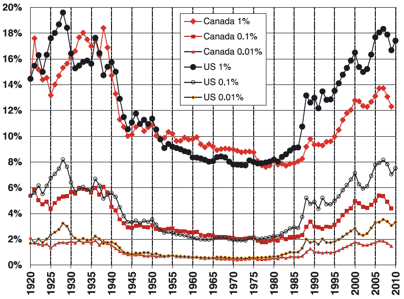
The share of top incomes in Canada began increasing in 1980, and particularly after 1995, the changes in the Canadian numbers mimicking the US figures of a couple of years back.
This is a major trend development that is not going to go away. So it is natural to ask what the underlying causes are, and also what the implications could be.
For example, is it possible that rising top shares have changed political priorities? Is it possible that they erode the political will to lower inequality? To change the tax system or income support programs?
That is why I have offered the Gini coefficient and the Average-Median ratio based not just on market incomes, but also incomes measured after taxes and transfers.
During the 1970s and 1980s market income inequality increased significantly, but taxes and transfers worked strongly to leave inequality of take-home incomes unchanged. You can see this in the Gini based on after tax – after transfer incomes.
It is also particularly clear in the Average-Median ratio. The market income measure of this ratio shot up at the onset of the 1990 recession, but remained unchanged for incomes after tax and transfer.
Post 1995 inequality after taxes and transfers notches up, as if the tax-transfer system reached a limit in its capacity to sail against market winds.
What exactly is driving the underlying changes in market inequality? Have we reached the limits of redistribution? Will rising top shares give more voice to the rich in setting social objectives? In determining not just outcomes, but also opportunities? Or even: does Mr. Doyle deserve his millions?
These would be interesting questions to discuss.
So the converse of our rule 3 for good pundit behaviour is: If you want to obstruct debate and score points for your side, take a grain of truth and consider it to be a universal law that you can use to hit any counter-argument to your preconceived ideas out of the park. Because you saw it in the Gini, just repeat that inequality has not increased to any puzzled observers.
Your defence against this? I’m not certain. Maybe just give them all the rope they want, hubris usually corrects itself.
And perhaps that is the golden rule for all pundits: be open to changing your mind.

You have to correct all graphs to the change in the average household size. Which has been falling in the USA and likely in Canada since the 1960s. Obviously, when one distributes the same income over a larger number of households the avearge income and median income must fall. When you check personal incomes, the effect of increasing inequality fades away.
Thank you very much for this insight.
You are certainly right to suggest that the data I used is a broad and first cut. I purposely wanted to start at this level because it incorporates all of the potential drivers of inequality. Total household income reflects the demographics of the household, certainly how many members but also their ages. It also reflects the degree of assortative mating, the degree to which individuals of similar earnings power (education) become partners. Then it reflects their labour force participation and hours of work, and finally it reflects their wage rates.
To get the full picture we have to step through each of these levels, but I thought the best way to start was at the broadest level. If something is happening at that level then at least the stage is set for looking at the others.
Household size, as you suggest, is over the long-term also falling in Canada. That is one of the ways households have adjusted to labour market developments, particularly polarization in job prospects and wage rates. So these other factors would also be interesting to look at.
There is nice picture on page 27 of the OECD report Divided We Stand that charts out the levels of a full analysis.
thanks, m.
This is methodologically wrong to present the household mean and Gini without correction for the change in the household composition. This values are all biased and represent no actual change in inequality (http://mechonomic.blogspot.co.at/2012/09/income-inequality-for-households-long.html ).
Not to be snarky but isn’t pundit behavior precisely ignoring those principles?
Somebody on Facebook drew my attention to the following:-
http://www.moveon.org/share/72e232/hollywood-legend-ed-asner-has-outraged-republicans?rc=fb-comments
It might even be found to be amusing, even if it isn’t strictly accurate in its portrayal of what we are all up against.
As I’ve indicated on previous occasions, in my own personal view one of the problems posed by all this inequality is the way in which it prevents many people – those out of work, that is – from contributing to the tax base, thus compromising government as well as the economy in general. Meanwhile, the super-rich can feel comfortable claiming that they are doing all the work – and that those not working are just “parasites” who got into that position because “….it’s their attitude…..”, or some such. The rich people might also claim that “….there are lots of jobs….”, or some such – when in fact it’s only true for people who “….know somebody….” (i.e. have lots of professional referees) and they like to tell anyone out of work that “…you have to know somebody…” if you want a job, which also means a ticket to view some of the the contents of the so-called “hidden job market”. Meanwhile they think those who don’t have any access, or very limited access, to the “hidden job market” can just “get lost”, or some such. See also my web site at http://www.unempgeninfo.com
I personally tend to see the correction of this state of affairs as a challenge in economics, rather than a political challenge.
At the same time, what’s actually happening is that in most cases working people are really functioning as factors of production tax revenue and not actually paying taxes directly – because income taxes are deducted “at source”. If they did not have jobs in the first place, that could not happen. And the fact that they have jobs, or are successful entrepreneurs in their own right, partly depends on the performance of the economy as a whole.
For people with persistent trouble over being out of work, any decision to make serious efforts to correct the underlying problems can be considered to be economic as much as political, or vice-versa. In fact, based on the postings in some other blogs, I believe Professor Corak’s view is that the overall challenge is political rather than economic.
At the same time, amid all this it appears to me that the rich people are forgetting that the Capitalist economic system is an incentives-based system that is supposed to generate adequate incentives for everybody, if it is to work properly. People without incentives or opportunity have no assurance of any return on effort and time invested to better themselves. One could also say that the super rich think this matters only to themselves – and that everybody else can just “get lost”, or some such. In so doing, it seems to me that they are simply proving their own incompetence by proving that they don’t know how a Capitalist economy is supposed to work. And that is not all, by any means.
Having said what I’ve said, I am not an economist but a professional engineer from the U.K. But I get more interested in economics all the time, and I make it my business to get to the bottom of the cause-and-effect relationships involved. No simple matter, either, when so much in economics depends on human behaviour in response to positive incentives – or lack of them.
Thanks for sharing this Robert.
Thanks Dr. Corak, I was linked to here from a MacLeans article that referenced your blog. This was a really useful walk through a complex subject. Yes, there are still more layers of complexity (it seems there always are), but this does provide a good primer for those of us without econ degrees.