
To some there would appear to be a debate over whether inequality has increased in Canada. My view is that it has in fact increased, but at the same time its nature has changed.
However, a recent report released by the economic analysis branch of the TD Bank has been interpreted by a columnist at one important national news paper to suggest that inequality has not been changing. Some readers of my December 16th post , which attempted to clarify this perspective, have asked for my own interpretation of the TD report. This is what I offer here.
In my view the report offers a reasonable portrait of income developments in Canada, as summarized by the major messages in the highlights section. But unfortunately the wording and structure of the report could have been clearer. The take-away message is not that inequality has been unchanged, rather that one statistic often used to measure it has been unchanged, and that to get a more accurate picture requires us to use more than one indicator.
This is something that is not really news, but is nonetheless worthy to repeat.
Red Flag 1 : how to define income
Take a look at Chart 1 in the report, which I reproduce below. Forget about the US numbers for now, and keep your eye on the Canadian numbers.

This is a very different message than what I offered as the first chart of my December 16th post. For one thing median incomes are higher, generally above $50,000, and for another they are trending upward, incomes in 2008 being higher than in 1980.
Now read the text: “all incomes figures in Charts 1-4 are before taxes, include government transfers and are adjusted for inflation”.
Why would you define income in that way? This definition does not capture the workings of the marketplace because government transfers are included, and at the same time it doesn’t fully capture the workings of the public policy because taxes are not included.
Here is my original chart of the evolution of median market income supplemented with the median after taxes and transfers. This is very different from the TD’s Chart 1 (assuming I am using the same definition of households as the TD authors, who don’t offer enough detail for me to completely verify the case).
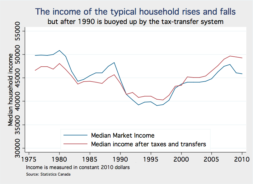
The ups and downs of market incomes are not as great after taxes and transfers, and post 1990 the median household would appear to be a net beneficiary of the tax-transfer system with the result that their incomes are actually a bit more than $1,000 higher in 2008 than in 1980.
Why does the TD report use this particular definition of income? Francis Fong, one of the authors, explained to me that the US statistics he and his co-author were relying upon were defined this way. And there is now an addendum to the original report exploring the sensitivity of the results to the definition of income on the TD website.
But the whole purpose of this definition of income is not to get the best picture of Canadian incomes, it is to get the best picture that is appropriate for a US comparison. This takes us to Red Flag 2.
Red Flag 2: compare apples to apples
Let’s put aside a concern that defining income in this way may bias the results (propping up Canadian incomes at the bottom, and lowering them at the top relative to the US, Canadian transfer payments being more generous and taxes likely more progressive), or that it is impossible to find US statistics defined in other more appropriate ways. Even if we accept this way of defining things, it still does not mean that Chart 1 is comparing apples to apples.
Canadian incomes are measured in Canadian dollars, American incomes are measured in American dollars.
Chart 1 is not informative at all about the relative incomes in the two countries. It probably should not have been included in the report, and at best has to be read in conjunction with Chart 4.

This corrects for differences in currency values, and makes clear the very important role of rising commodity prices on Canadian incomes. The Purchasing Power Parity index used to make this correction has been increasing since at least 2002, and notably so after 2006.
Bottom line: Canada is in the middle of a resource based boom, the US has yet to fully recover from the worst recession of the post war period. That is all they are saying, it is also one of the drivers of the inequality statistics used in the remainder of the report.
Red Flag 3: don’t run with a misleading lead!
But the most provocative statement of the report is the heading at the bottom of page 3, which in bold states: “Income inequality has been unchanged in Canada — say what?”
For a journalist looking for a story this is clearly positioned as news.
The authors examine the evolution of the Gini coefficient, an often used indicator of inequality, and show that it is not much changed since the late 1990s. Their approach in the remainder of the report is the correct one: the message the Gini is sending doesn’t pass the smell test, and it is important to look at other statistics to get a full picture.
They make the point that the Gini is based upon survey data that may not fully capture the incomes of those at the very top and bottom. They might have also added, as I stressed in my previous post, that the Gini by construction is not sensitive to movements in the tails of the distribution.
The major flaw is the misleading lead to this section. The message I take is not that inequality has been constant. Rather, that its nature is changing and we need different statistics to capture this reality. Some of the wording, even in the highlights, is unfortunately misleading: “The stable (rather than worsening) trend in Canadian income inequality may come as a surprise in light of the heavy global focus on the growing divide between rich and poor in recent years.”
But really what they are saying is that a traditional measure of inequality doesn’t paint the whole picture, relying on one statistic can be misleading, and we need to look at the data in more detail from different angles. Whether they do that effectively or not in the remainder of the report is open to discussion. That said, journalists and others can be forgiven if they took the message to be that inequality was unchanged: more care in wording would have helped to prevent confusion.
But frankly the finding that the Gini has been constant after about 2000 is not news: the OECD shows this in their very detailed publication called Divided We Stand released in the autumn of 2011; the Centre for the Studies of Living Standards released a report in September showing the same thing and more carefully using different definitions of income to tell a story about how markets and tax-transfers play out; and more than a year ago Stephen Gordon offered this post charting the developments of a host of inequality statistics and suggesting the need to recognize the different dimensions of the issue

I too was having issues with the TD Report — particularly, as you point out — the headline about the gini being constant. While it has been relatively constant since 2000, it is still at a much higher level than it has been in previous decades.
Thanks Brenda. Yes my main concern about the report is more an issue of presentation, than the analysis, and I agree with you that being clear on the time horizon is important.
Well, what HAS happened with inequality in Canada then? I am not an economist. Thank you for your reports.
Sorry Miles, what I mean is this: I understand that your view is that inequality has increased and that you believe that the TD report was, in various ways, not as appropriate as you think it could have been.
But I am not clear what, on your view, has caused increased inequality in Canada. Perhaps I am missing something very basic? Thank you.
Thanks for this Mike. This is exactly the question we should be addressing, and also why does it matter.
On why inequality has been increasing take a look at a couple of other posts listed under the “inequality” tab of the web site.
For example, here is a discussion of top shares: https://milescorak.com/2012/10/18/inequality-and-top-income-shares-in-canada-recent-trends-and-policy-implications/
And here is a summary of a recent research paper that looks more comprehensively at the issue: https://milescorak.com/2012/05/30/canadian-inequality-recent-development-and-policy-options/
In many other posts I discuss why we should care. My own view is that the most important reason is that more unequal societies tend to have less opportunity.
Feel to keep the conversation going.
best, m.
I wonder if it’s OK to post related recent stories Miles? If not, let me know.
Thank you. Mike
1) A new report from U.S.-based, “The Working Poor Families Project” (Winter 2012-13):
Click to access Winter-2012_2013-WPFP-Data-Brief.pdf
2) Non-specialist commentary on the report: http://www.commondreams.org/headline/2013/01/15-2
In a chart title, “buoyed” is misspelled as “bouyed.”
Thanks! Much appreciated. I’ve made the correction.